At a glance
Teams tracked media, stakeholders and engagement in separate tools, so insight never connected.
Lead UX/UI designer, end to end: research, IA, design system, every feature area and the AI interaction model.
One platform where daily monitoring also produces disclosure-ready reporting.
8
Major feature areas designed from scratch
1M+
Stakeholders in the platform database
30+
Global markets covered
3+ yrs
End-to-end design ownership
Drowning in information, starving for intelligence
Government affairs, comms and sustainability teams track regulators, NGOs and media across dozens of markets. Their tools held the data but never connected it.
Before Genie
- Media monitoring tools with high noise, low signal
- Stakeholder records in spreadsheets or sales CRMs
- ESG reports compiled manually twice a year
- NGO network research outsourced to consultants
- AI analysis in a separate tool, insights lost between sessions
With Genie
- Continuous issue monitoring filtered for relevance
- Centralised stakeholder profiles with engagement history
- Disclosure-ready reporting from the same daily workflow
- Visual NGO network maps built and maintained in-platform
- Ask Genie AI insights saved and traceable on the profile
Three users, three ways of working
I didn't design for a generic "enterprise user". Each role needed a different entry point into the same data.
The Signal Analyst
Scans high volumes of coverage quickly and turns it into briefings.
The Engagement Manager
Keeps context on hundreds of stakeholders and prepares for meetings.
The Strategy Lead
Needs the landscape: how issues and influence move across regions.
Every decision was tested against one question: does this help users build an ongoing picture, or does it produce a snapshot that goes stale?
Make issues the thread that connects everything
My biggest decision wasn't a screen. It was making issues (the topics and risks a team tracks) the organising principle, instead of stakeholders or media.
Information architecture: issues connect every feature area
- Mapped real information flows with analysts and engagement managers before designing anything.
- Designed navigation before features, so the left nav stays a stable anchor across every area.
- Built GENIE DS alongside the features, not after, so it reflects real usage.
- Put Ask Genie inside every workflow (profile, feed, dashboard, canvas) instead of on a separate page.
Product tour
Filter by area, then click any screen to view it full size. Use ← → or swipe to browse.
Screens from the live product. People, contact details and internal names are anonymised.
Key workflows
How the features connect in practice. These are three journeys I designed end to end.
From a signal to an action
Goal: respond to a sentiment shift in a market
-
Spot the shift
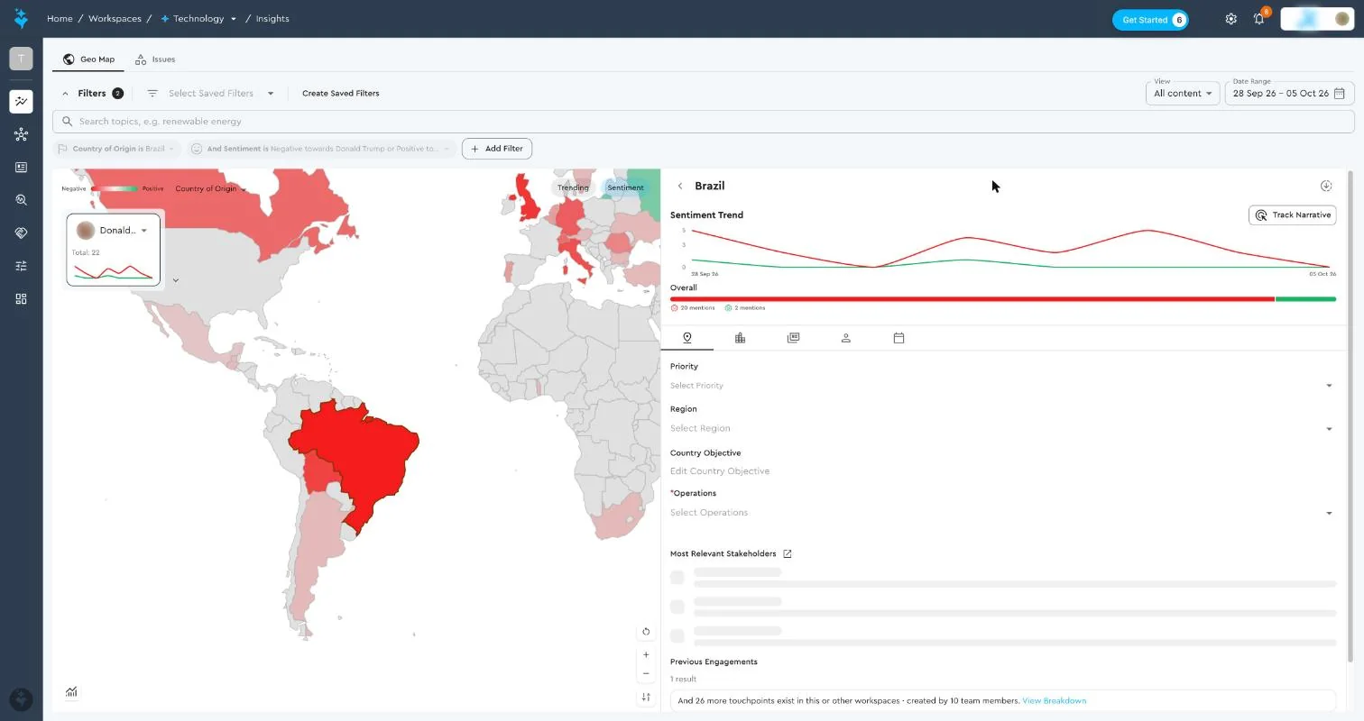
Geo Map flags negative sentiment in a country
-
Drill into the market
Trend, objectives and the most relevant stakeholders
-
Open the profile
Key points, issues and engagement history
-
Log the response
A touchpoint linked to the issue, project and country
-
Track coverage
The dashboard shows activity by issue and geography
Result: monitoring and engagement run in one loop, with no exporting between a media tool and a CRM.
Meeting prep in minutes
Goal: brief an executive before a stakeholder meeting
-
Find the stakeholder
Search ~1M profiles by name or topic
-
Scan the profile
Skim mode up top, deep-dive tabs below
-
AI
Generate a Power Brief
One click asks Genie why this stakeholder matters
-
Review cited analysis
Risks, opportunities and talking points, each with a source
-
Save to notes
The next teammate starts with the context
Result: prep that used to take hours of manual research becomes a cited brief in under a minute.
Plan and track an engagement programme
Goal: run a multi-month plan and report progress
-
Create a project
Folders plus touchpoint and stakeholder targets
-
Map the influence
Build the stakeholder network on the canvas
-
Log touchpoints
Meetings, releases and calls count toward targets
-
Measure
Dashboards track progress, mentions and trends
Result: leaders see progress against targets without asking for a status report.
Impact: one client example
A natural resources company runs ESG intelligence across 10+ countries in 4 languages on Genie. The same daily workflow now produces Section 172, CSRD and GRI-ready reporting.
Daily
Issue monitoring (was periodic)
Live
NGO mapping (was annual consultancy)
On-demand
Disclosure reporting (was twice-yearly manual)
"What began as a centralised ESG intelligence platform has become the operational backbone for the global sustainable development function."
What I learned
- Information architecture is product strategy. Choosing issues as the backbone decided what Genie could do.
- Build the design system with the features. GENIE DS stayed grounded in real usage.
- The value is in the connections. Designing the flows between features mattered more than any single screen.