See all works
0→1 Feature Graph UI Real-time Collaboration AI Integration Enterprise UX

Making relationship intelligence native to the platform — not a workaround in Miro

I built the Network feature for Genie from scratch — a visual canvas that lets enterprise communications teams map how their stakeholders relate to each other, discover connection paths, and move from raw data to relationship insight without leaving the platform.

My Role

Lead UX/UI Designer

Company

TSC.ai

Year

2025 — 2026

Type

0 → 1 feature design

Platform

Web — Genie enterprise

Genie Networks — index view showing 140 stakeholder network maps in grid layout

Networks index — grid view of 140 stakeholder networks with search, filters, and sort

Section I

Why I built this — and what Genie was missing

Genie already had strong foundations when I designed this feature — stakeholder profiles, media monitoring, engagement planning, AI-assisted analysis. What it was missing was any sense of how things connected. You could look up a stakeholder and see everything about them. But you couldn't see how they related to anyone else in your network, or navigate those relationships as a system.

That gap was the starting point for Networks.

4

Entry points to create a network from existing platform context

12+

Types of entity that can become a node

0→1

No relationship mapping existed in Genie before this feature

Section II

Relationship context existed everywhere — except inside the tool teams actually used

When I started talking to the engagement managers using Genie, I kept hearing a version of the same thing. They had built up deep knowledge about their stakeholder landscapes — who influenced whom, which journalists covered the same beats as certain officials, which organisations had overlapping interests. But none of that relational knowledge was anywhere in the system. It lived in their heads, in spreadsheets they'd made months ago, or in Miro boards that were accurate the day they were created and stale by the following week.

Every time a team needed to think relationally — who do we know who can reach this person, what does the influence map look like around this issue — they had to rebuild that picture manually from scratch. It was slow, it was fragile, and it broke the moment a stakeholder changed roles or a new connection emerged.

There was a second problem: when teams did build those maps externally, the maps had no connection to Genie's data. The two views of the same stakeholder were completely separate, and switching between them created constant friction.

Every time a team needed to think relationally, they had to rebuild that picture manually from scratch. It was slow, it was fragile, and it broke the moment a stakeholder changed roles.

Section III

Make relationships a first-class part of the platform

The goal wasn't to build a standalone graph tool. It was to make relationship mapping feel native to Genie, so that the intelligence the platform already held — profiles, media coverage, AI analysis — could be accessed directly while working visually with stakeholder connections.

  • Let users build and explore a visual map of how their stakeholders connected
  • Every node had to be a live stakeholder profile — clicking a node shows everything Genie knew about that person
  • Users needed to discover paths between any two people in their network
  • The whole thing had to be connected to the rest of the platform — networks created from a stakeholder profile, an AI insight, or an engagement project, not only from a blank starting point
Section IV

Three decisions that shaped the entire feature

Separate the information model before designing any screen

A network has two kinds of information that need to be handled differently. There's descriptive information — what a node represents, what kind of entity it is — and there's graph-specific information — where nodes sit on the canvas, positions, layout. I made the decision early to handle these separately. The descriptive data lives alongside everything else in the platform. The graph state is handled independently to allow real-time collaboration, so two people working on the same network at the same time don't conflict.

Separate the canvas engine from the product features

The visual engine — how nodes and links are rendered, how force-directed layout works, how pan and zoom behave — was designed as a stable, self-contained layer. Everything specific to the Networks product experience was built as a layer on top of the engine rather than tangled into it.

Within six months of launching Networks, we were already embedding the same graph engine in the stakeholder profile as a context widget. That wouldn't have been possible if the product features had been built directly into the canvas layer.

Design the list and creation flows before the canvas

It's easy to get drawn straight into the canvas. But most user interactions with Networks don't start there — they start on the list page, or somewhere else in the platform. I designed those flows first. The index page gives users grid and list views, lets them filter by keyword or stakeholder, and exposes four distinct ways to start a new network depending on where they are: from a stakeholder profile, from an Ask Genie insight, from an engagement project, or from a piece of content. The canvas was designed last.

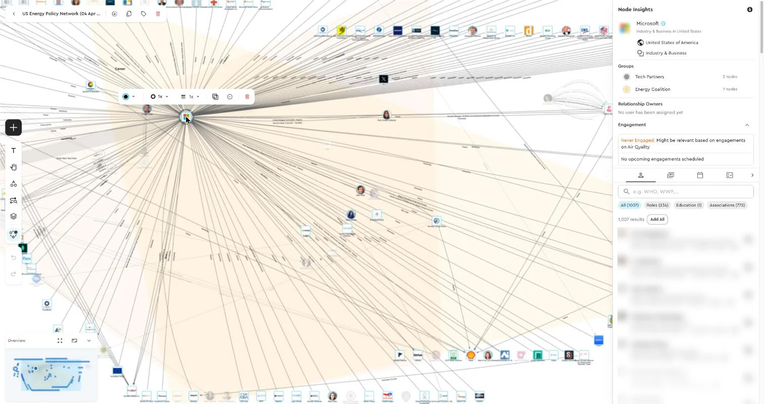
Networks index — grid view of stakeholder network maps with filters Networks canvas — force-directed stakeholder map with node detail panel

Networks index — grid view (left) and canvas editor with stakeholder node (right)

Section V

What shipped

Shipped

Network List

Grid and list views, filters by keyword and stakeholder, sort by date or name

Shipped

4 Context Entry Points

Create from a stakeholder profile, Ask Genie insight, engagement project, or piece of content — each pre-populates the graph

Shipped

Canvas Editor

Full-width immersive canvas; force-directed layout; pan, zoom, node selection, toolbar

Shipped

Node Detail Panel

Click any node to open the full stakeholder profile, notes, media coverage, and AI insights — without leaving the canvas

Shipped

Path Discovery

Select any two nodes to surface the shortest relational path between them across the full network

Shipped

Real-time Collaboration

Multiple users can work on the same network simultaneously; changes appear live without a page refresh

Networks canvas with Ask Genie AI panel — network analysis showing 20 nodes, relationship clusters, and AI-generated insights

Canvas + Ask Genie — AI analysis of the stakeholder network surfaced directly alongside the visual map

Section VI

Shipped as a flagship feature — and a foundation for what came next

"The Networks feature was the thing that made Genie feel like a platform, not just a database. Before, we had all the data but no way to see the shape of it."

Networks shipped as a complete experience: list management, four context-driven creation flows, a full canvas editor with real-time collaboration, path discovery, and a node detail panel that pulls in the full intelligence layer.

The feature also delivered something I hadn't anticipated as clearly at the start: it became a reusable foundation. The canvas engine is now embedded in two other parts of the platform, and the design patterns established for how nodes behave and how context travels between screens became reference points for every feature that came after it.

4 creation entry points Real-time collaboration Force-directed canvas Ask Genie node suggestions Path discovery Reusable graph engine

Other TSC case studies

TSC.ai · Platform

Designing Genie — 0→1 Platform

TSC.ai · Feature

Stakeholder Notes & Ask Genie